Dashboards y reportes de proyecto que nunca tienes que rehacer
Una hoja de cálculo de estado queda desactualizada en el momento en que pegas los datos. Placker crea dashboards directamente a partir de los datos de tu proyecto en tiempo real, cubriendo tareas, fechas, responsables y esfuerzo, y los mantiene al día conforme avanza el trabajo. El reporte que compartes a las nueve sigue coincidiendo con el plan al mediodía.
Resumen rápido
Reportes en Placker
Dashboards en vivo, creados directamente a partir de tus tarjetas. Esto es lo que te dan:
- Siempre el número en vivo. Los dashboards leen tus tarjetas directamente, así que los estados, las fechas de entrega, los responsables y el esfuerzo muestran el plan tal como está ahora, no la última exportación.
- Todos los tableros en una sola vista. Combina varios tableros o proyectos en un solo dashboard de cartera, en lugar de revisar cada uno por separado.
- Los widgets que necesita tu revisión. Arma bloques de KPI, gráficas de barras y de líneas, tablas dinámicas, tablas de tarjetas, gráficas de dona y de pastel, y vistas de capacidad para que encajen con cómo se lleva tu reunión.
- Entregado sin rehacer nada. Exporta cualquier dashboard a PDF o programa un correo recurrente para que las partes interesadas reciban los mismos números con una periodicidad fija, sin retrabajo manual.
Reportes en vivo
Dashboards y reportes de proyecto sobre el plan tal como está ahora
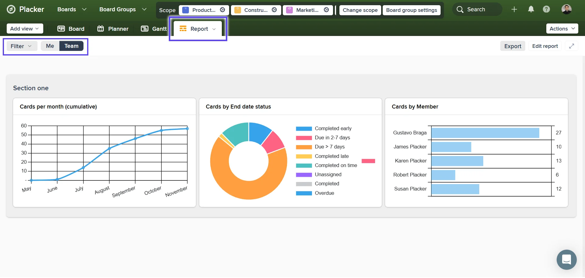
Los datos de tus tareas en tiempo real, incluyendo estado, fechas, responsables y esfuerzo, se muestran como gráficas. Dejas de mantener una hoja de cálculo de estado aparte que se aleja de la realidad entre una actualización y otra. Un líder de entrega abre en la revisión del lunes el mismo dashboard en el que el equipo trabajó el viernes, y los números coinciden.
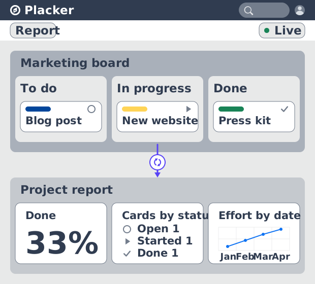
Vista de cartera
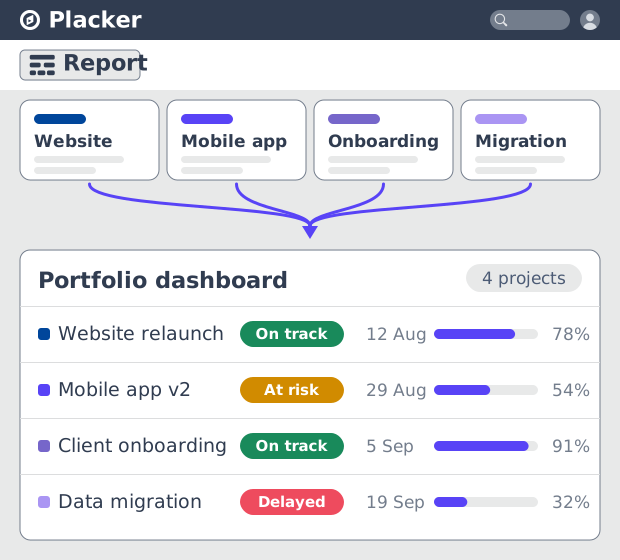
Reúne varios proyectos en una sola vista de cartera
Ese dashboard cubre un proyecto, pero puedes agrupar proyectos para que una sola vista abarque todo un programa o la cartera de un cliente. Una PMO ve qué proyecto está en rojo sin abrir cada uno por separado. El reporte de cartera, que antes significaba una recopilación manual a fin de mes, se vuelve una vista que abres cuando la necesitas.
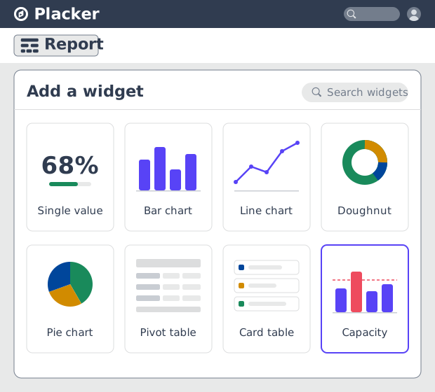
Biblioteca de widgets
Empareja el widget con la métrica
Esas vistas se arman a partir de una biblioteca de widgets que abarca bloques de un solo valor, gráficas de barras y de líneas, tablas dinámicas, tablas de tarjetas, gráficas de dona y de pastel, y planificación de capacidad. Construyes justo la vista que te pide un socio de finanzas o un líder de operaciones, en lugar de meter cada métrica en una sola gráfica. Los widgets de capacidad muestran quién está sobrecargado antes de que le caiga la siguiente asignación.
Cómo funciona
Cuatro pasos de un proyecto a un panel que puedes enviar.
- 1
Agrega tus proyectos
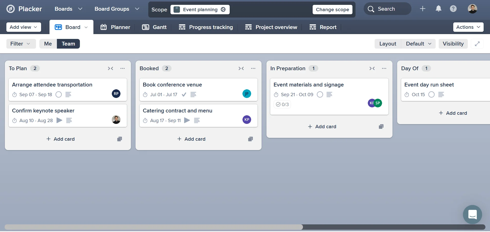
Crea proyectos en Placker o importa trabajo existente, para que tus tareas, fechas y responsables estén en un solo lugar.
- 2
Abre la vista de Reporte
Desde un proyecto o un portafolio, abre el Reporte y comienza desde el diseño destacado.
- 3
Arma el panel
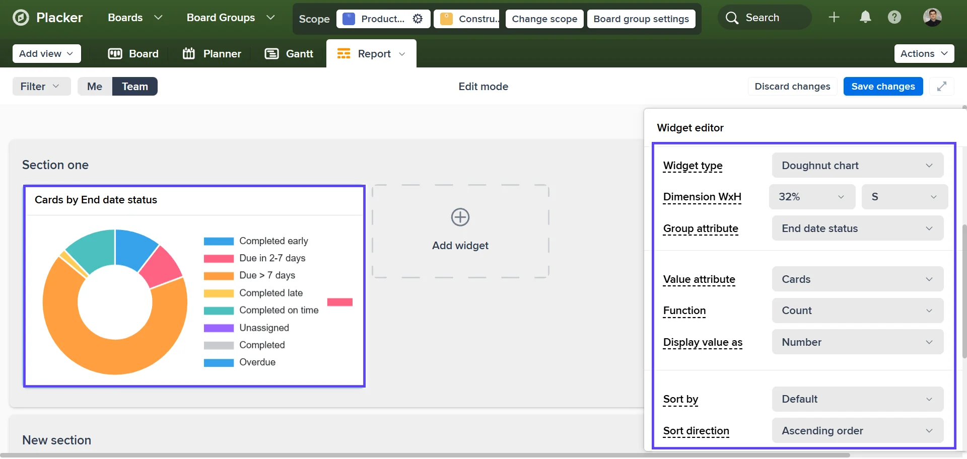
Agrega widgets, apunta cada uno a un campo de tarea y filtra por estado, responsable o etiqueta para enfocar la vista.
- 4
Comparte o programa
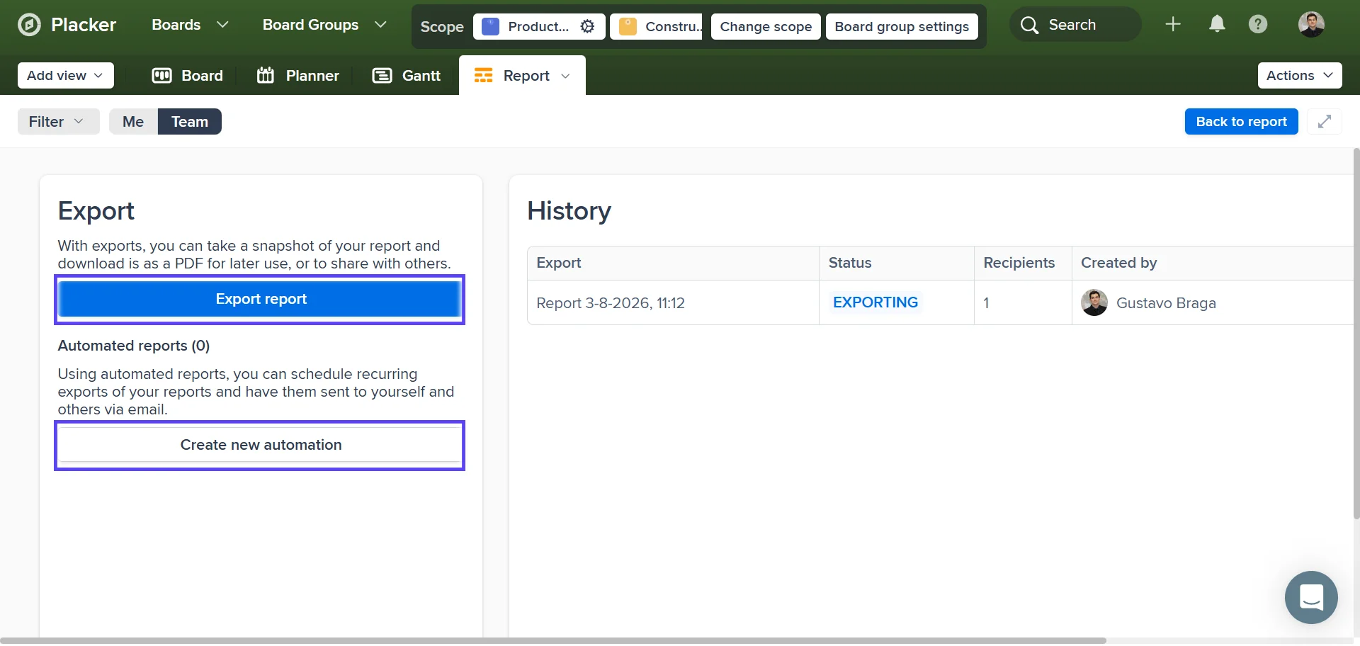
Exporta a PDF o configura un correo recurrente en Reportes automáticos para que el reporte llegue a tu equipo o cliente por sí solo.
Casos de uso
Mira cómo los equipos usan los reportes de Placker para dar seguimiento al progreso y tomar mejores decisiones.
Equipo de entrega de agencia
Gestiona un portafolio de proyectos de clientes, con un panel por cliente y un PDF semanal que sale sin que nadie tenga que armarlo.
Líder de servicios profesionales
Da seguimiento a la utilización con widgets de capacidad y al esfuerzo por persona, para que el próximo proyecto se asigne según la disponibilidad real.
Equipo de operaciones internas
Observa la entrada y el rendimiento en un gráfico de líneas para ver si la fila crece más rápido de lo que el equipo la despeja.
PMO o responsable del portafolio
Revisa un programa mediante la salud tipo semáforo de cada proyecto y profundiza en el que se puso rojo.
Consejos y buenas prácticas
Recomendaciones prácticas para aprovechar al máximo tu flujo de trabajo
Divide tareas en tarjetas hijas para afinar tus reportes
Los reportes cuentan cada tarjeta, así que dividir tareas grandes en Tarjetas Padre-Hijo le da a tus paneles datos de progreso y carga de trabajo más detallados, en lugar de una sola línea de todo o nada.
Filtra reportes por rango de fechas para revisar un sprint o una fase del proyecto
Filtra tus reportes a una ventana de tiempo específica para tener una vista enfocada de cómo avanzó el trabajo durante un sprint, un trimestre o cualquier otro periodo que te importe.
Exporta tu reporte a PDF o CSV para compartirlo con las partes interesadas
Comparte reportes de Placker con líderes de equipo o clientes que necesitan visibilidad sin necesitar acceso a Placker. El PDF funciona muy bien para presentaciones; el CSV es perfecto para un análisis más a fondo en una hoja de cálculo.
Da seguimiento al progreso a lo largo del tiempo comparando reportes consecutivos
Ejecuta el mismo reporte en semanas o sprints consecutivos y compara los resultados. Ver las tendencias que surgen con el tiempo es una de las formas más poderosas de mejorar cómo tu equipo planea y entrega.
Páginas relacionadas
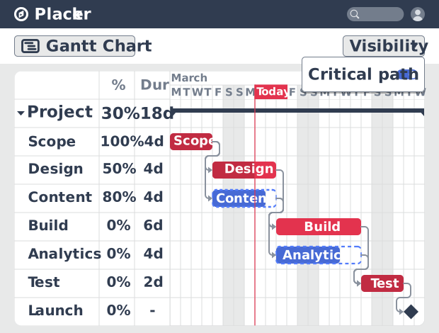
Diagrama de Gantt
Planea proyectos en un cronograma visual con el software de Diagrama de Gantt de Placker. Define dependencias, programa las fechas y sigue la ruta crítica.
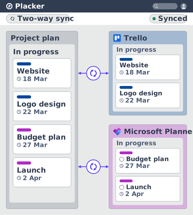
Integraciones de Placker: sincroniza tus herramientas
Las integraciones de Placker sincronizan Trello, Microsoft Planner, Google Calendar, Clockify y Zapier en dos sentidos, con un plan en todas las herramientas.
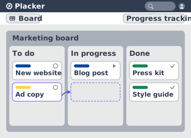
Vistas de tablero: un tablero, cualquier vista
Ve tu trabajo como tarjetas que avanzan por listas en Placker. Agrupa por miembro, carril o fecha de entrega y sigue el flujo con reportes Kanban.
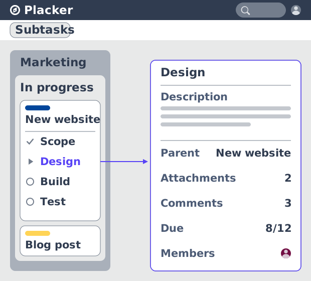
Tarjetas padre-hijo en Placker | Subtareas que suman
Las tarjetas padre-hijo en Placker dan a cada subtarea una tarjeta completa y suman esfuerzo, fechas y miembros en el padre. Lee el total arriba.
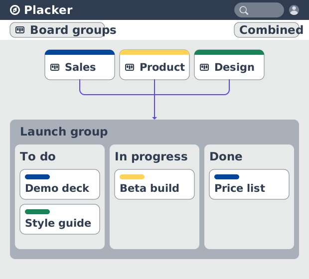
Grupos de Tableros: muchos tableros, gestionados como uno
Los Grupos de Tableros gestionan muchos tableros como un solo espacio: planea, filtra y reporta en todos, y guarda grupos reutilizables. Prueba gratis.
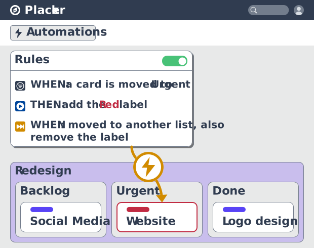
Reglas de automatización de tableros de proyecto, no-code
Automatiza tableros de proyecto con reglas condicionales. Placker crea espejos, mueve, asigna y actualiza tarjetas al cambiar el trabajo. Mira cómo funciona.
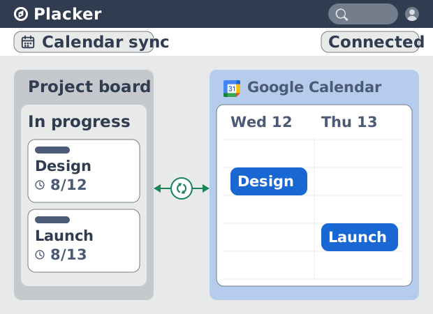
Sincronización de Placker con Google Calendar: bidireccional, en tiempo real
Placker sincroniza cada tarjeta con fecha con Google Calendar, en ambos sentidos y en menos de un minuto. Edita cualquiera; todo queda alineado. Prueba gratis.
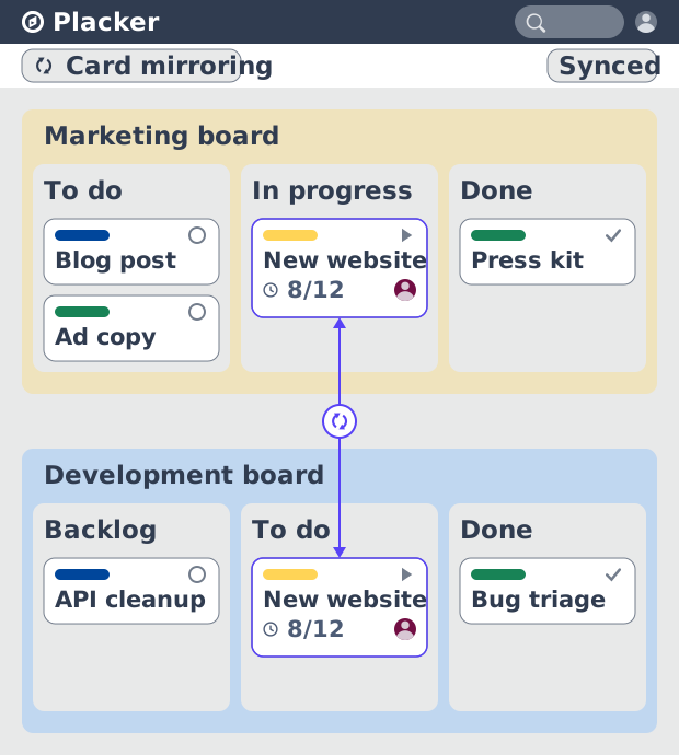
Espejo de tarjetas en Placker: sincronización bidireccional
El Espejo de tarjetas mantiene una tarea viva en cada tablero de Placker. Edita una tarjeta una vez y estado, fechas y miembros se actualizan en segundos.
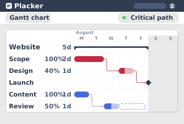
Ruta crítica en Placker: análisis CPM en diagrama de Gantt
La ruta crítica en Placker encuentra las tareas que controlan tu fecha límite y las marca en el Gantt, con actualización en vivo. Prueba gratis.
¿Todo listo para comenzar?
Fácil de configurar, sin tarjeta de crédito. ¡Comienza tu prueba hoy mismo!