Build a project status reporting routine with Placker
Set the cadence once, fix the metrics, and let the report assemble itself from the task data your team already keeps current.
Quick facts
Project status reporting at a glance
A status report answers one question for each audience, and in Placker it assembles itself from live cards:
- One question, per audience. Each report says where the project stands and what you need from the reader: to inform, to request a decision, or to escalate a risk.
- Health up top, detail below. RAG status belongs in the executive summary, with the supporting numbers kept in the body.
- Assembled from live cards. The answer is built from the cards the team already updates, so your time goes on interpreting numbers rather than collecting them.
- Fixed metrics, set cadence. Choose a cadence per audience and hold the metric set steady, and the series becomes comparable period to period.
- Delivery runs itself. Export automation emails a link and a PDF on schedule, so the report goes out without you assembling it.
Phase 1: the brief
Decide what the report is for, and who reads it
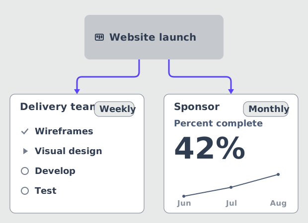
A weekly note to the delivery team and a monthly summary for the sponsor are two different documents.
Most status reports fail before anyone opens a reporting tool. The report goes to one distribution list on one cadence, so the delivery team gets a summary too thin to work from and the sponsor gets a task list they will not read. PMI treats this as a communications planning decision rather than a formatting one: work performance information goes to the right stakeholders, at the right level of detail, on an agreed schedule.
Start by naming the purpose. Every status report does one of three jobs: it informs, it requests a decision, or it escalates a risk. Then set the cadence per audience. Weekly suits a delivery team and any high-visibility project reporting up to management. Monthly suits a sponsor or a portfolio owner who needs the trend rather than the week. Write both down before you build anything, because the audience decides which metrics belong in the report and how much narration sits around them.
- Name the purpose
- List the audiences separately
- Fix the cadence per audience
Phase 2: the layout
Fix the layout once so periods stay comparable
Three documented starting points in Placker, and one of them is already built for this job.
A report that changes shape every period is a series of one-off documents. The value of a report series comes from comparability: the same metrics, in the same places, so the reader sees what changed instead of relearning the layout. Fix the layout once and the weekly effort drops to updating the narrative.
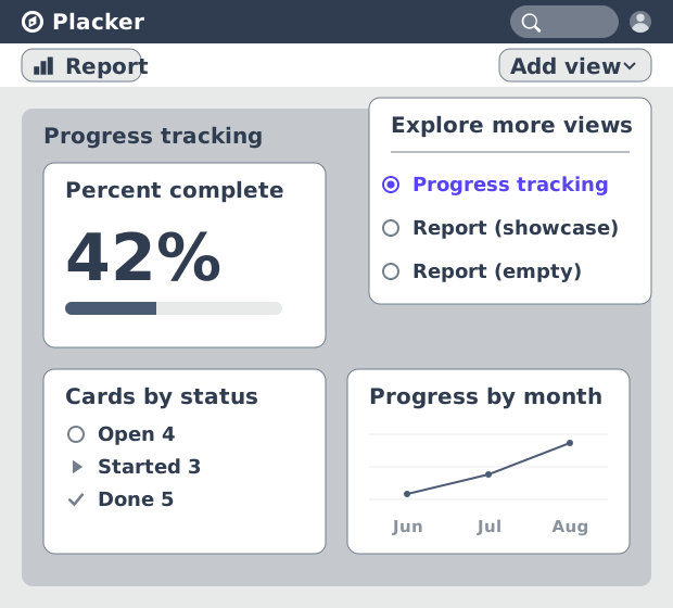
Placker gives you three documented starting points on a board. Open "Add view", then "Explore more views", and pick the "Progress Tracking" template, which is built around the metrics a status report carries. To start from a sample widget set instead, "Report (showcase)" opens a pre-built report, and "Report (empty)" gives a blank canvas. "Edit report" puts the view into editing mode. This is the same report view described on Reports in Placker, so whatever you set up here becomes the standing layout every future period reuses.
- Start from the Progress Tracking template
- Or start from showcase or empty
- Enter editing mode
- Freeze the metric set
Phase 3: the widgets
Map each status report field to a widget
The standard status-report field list has a close match in Placker's widget library.
The standard status report carries a small, stable field set: overall health, percent complete, what is done and what is next, who is loaded, and where the schedule lands. Placker's Progress Planning report documents a widget for almost all of them, which makes this phase a lookup rather than a design exercise.
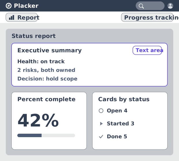
Put the executive summary in the Text area widget, which accepts Markdown, and write the health call plus the decision you need in three or four sentences at the top. The widgets carry the numbers underneath. One caveat comes from Placker's own guidance: only use widgets your board data supports. If the team does not maintain percentage complete, a progress widget will show a confident number that is not true, and status-based widgets are the honest substitute.
- Last plan end date
- Total progress
- Cards by status
- Cards by Traffic light
- Card table and member pivot
- Text area for the summary
Phase 4: delivery
Check the numbers, then let delivery run itself
Check a widget against the cards behind it, then put distribution on a schedule.
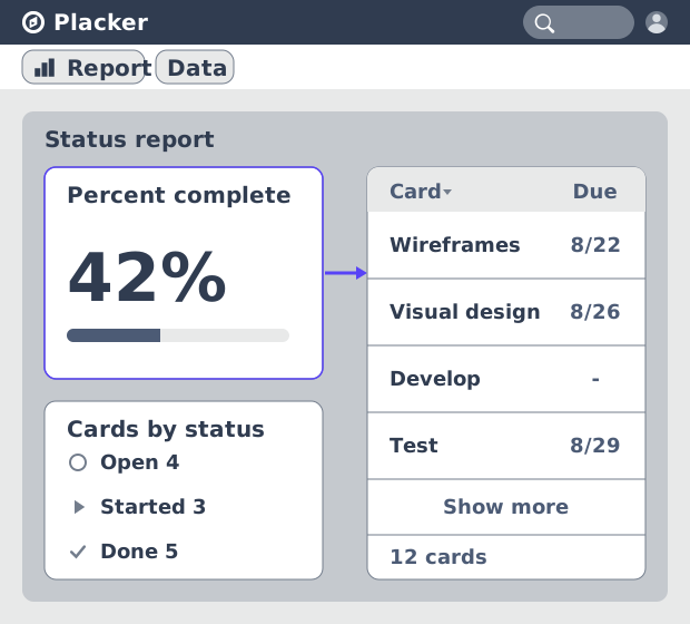
Two failure modes survive a good layout. The first is a number nobody trusts, which turns the status meeting into an argument about the data instead of a decision about the project. Click a widget, or open "Data" at the top left, and Placker lists the exact card records behind it. Card titles open the card and attributes can be edited there, so a date can be rescheduled during the meeting without leaving the report.
The second is the report that does not go out in a busy week, which is when stakeholders most need it. "Export" sets an automation that emails a link and a PDF, daily or weekly, on the week days you choose. The link needs an active Placker account, the PDF does not, so a client or an external sponsor can be added to the automation and still read the report. Where audiences need different levels of detail, save one report view per audience on the board, the same saved-view mechanism covered in board views.
- Verify before you send
- Schedule the delivery
- Add the external readers
What you have built
A standing report view that produces the status report on a schedule, from the cards your team already updates.
A standing report layout
One saved view with a fixed widget set, so each period is a data refresh rather than a rebuild.
A health call with the evidence under it
The Traffic light chart and the executive summary sit at the top. The card table and the member pivot hold the detail a challenge would need.
Delivery that happens without you
A scheduled export mails the link and the PDF to the audience list, so the cadence survives the weeks you are busiest.
A series that reads as a trend
Because the metric set is frozen, consecutive reports compare period to period instead of landing as unrelated snapshots.
Tips & Best Practices
Practical advice to get the most out of your workflow
Roll a programme into one report
Load several boards into a board group and the report covers the programme instead of a single project. The PMO reads one status view rather than collating a stack of per-project reports.
Scope a report with filters
A filter narrows a report to one phase, one workstream or one client without building a second view.
Reuse the layout on the next project
Save the report as a template and the next project opens with the same metric set. Reports then stay comparable across projects, not only across periods.
Use a custom field when Status does not fit
Custom attributes used for status work in reports as a substitute for the default Status field, so your own workflow stages drive the charts.
Related pages
The capabilities behind the report, each covered in full on its own page. Dashboards and reports are available on the Placker Pro plan.
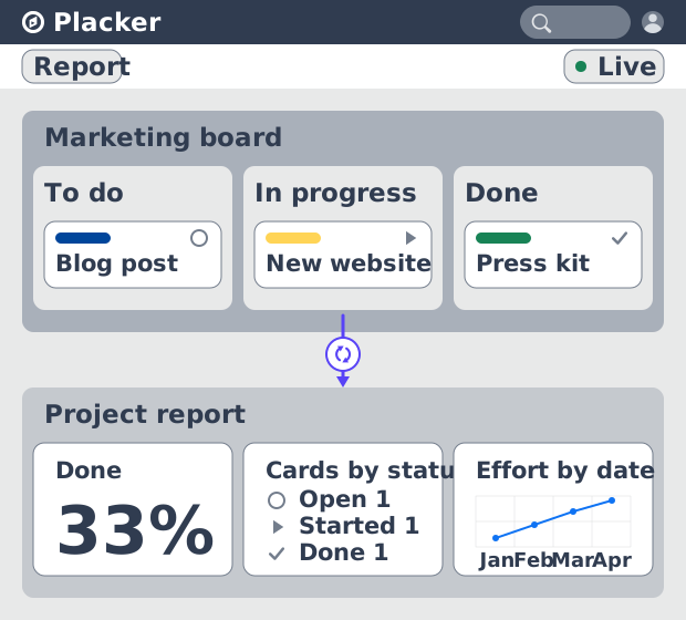
Reports in Placker
The report view itself: the widget library, the data area behind every chart, and scheduled exports.
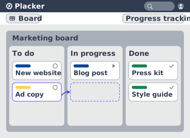
Board views
Saved views on a board, including keeping one report view per audience.
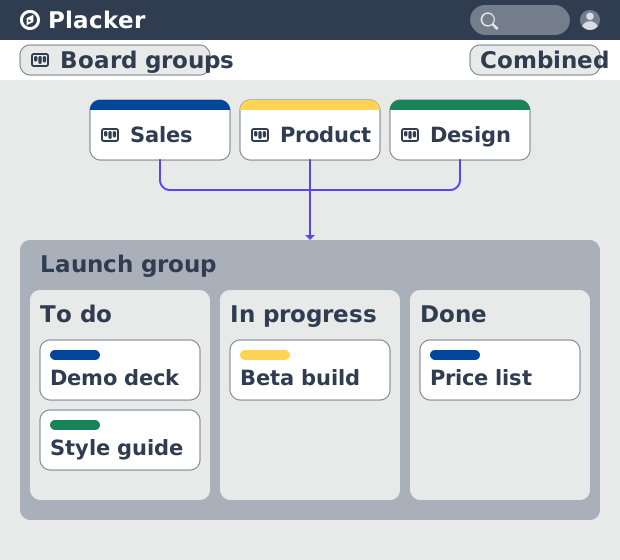
Board groups
Combine several boards into one scope so a single report covers a programme or portfolio.
Ready to get started?
Easy to setup, no credit card required, start your trial today!