Give sponsors a Microsoft Planner status report each week
Planner's charts show today, one plan at a time. Placker turns your plans into a report you can narrate, schedule and send.
Quick facts
Inside a Microsoft Planner status report
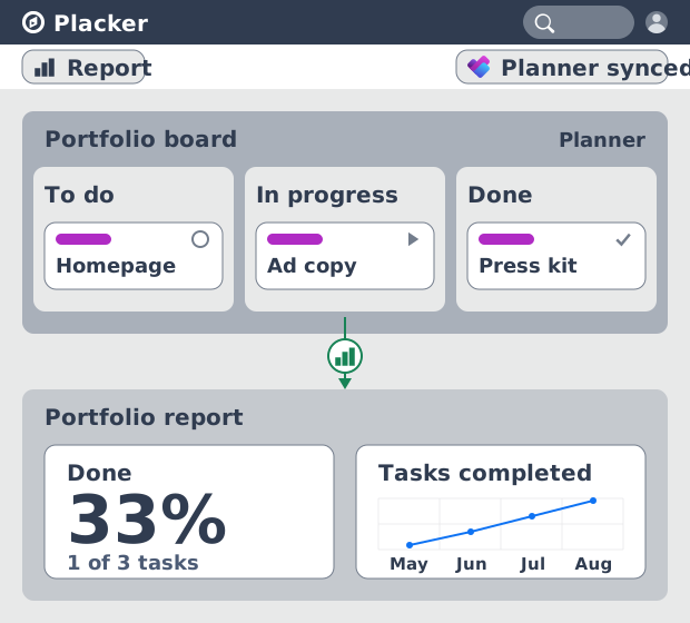
A status report is a different document from Planner's charts, and Placker builds it from your live tasks:
- Past the single-plan wall. Planner charts stop at the boundary of one plan, while a Placker report scope can span several plans at once.
- Built from Planner tasks. The report draws on the Planner tasks your team already updates, so nothing gets retyped between the plan and the report.
- Buckets and assignments carry over. Your existing buckets and assignments become the groupings inside the report.
- Narrate it in the summary. The executive summary lives in a Text area widget, and the data area lists the tasks behind any widget you add.
- Only the widgets your data supports. Placker offers the widgets your Planner data can actually fill, so the report stays honest to its source.
Before you open a plan
Name the reader before you name the metrics
A delivery lead reads a different document from the sponsor who owns four plans.
Reporting pressure in a Microsoft 365 shop rarely comes from one plan. It comes from a sponsor who owns four of them, a delivery lead living in one, and a PMO that wants the same shape from both. Planner gives each plan its own status, bucket and assignee charts and no way to reconcile them, so the opening question is not which chart to build. It is who is reading.
Fix the purpose first. A status report either reports progress, asks for a decision, or raises a risk, and that choice writes the opening paragraph. Then set a cadence per reader instead of one schedule for everyone. Weekly suits the team working the plan day to day. Monthly suits a sponsor who wants the trend line rather than the week. PMI puts this in the communications plan rather than the report layout, and everything downstream, including which widgets earn a place, follows from it.
- Name the job the report does
- List the readers separately
- Set a cadence per reader
- The level of detail each reader needs
- Write the brief down
Where the report lives
Start from the Progress Tracking template
Placker ships a prebuilt layout for exactly this job, plus two blanker starting points.
Planner's charts render fresh every time you open a plan, so there is no layout to hold steady and nothing to set last month beside this one. A report series only pays off when the same numbers sit in the same places each period. That standing layout has to live somewhere other than the plan.
Placker puts it on the plans you connect, as a saved view rather than a document you rebuild. Three starting points are documented, and one of them is already shaped for this job: the "Progress Tracking" template arrives carrying the fields a status report is built on, which makes it the shortest route from a connected plan to something a sponsor can read. The other two exist for when you want more control over what appears. Whichever you take, it is the same report view covered in full on Reports in Placker for MS Planner, and once it is saved the monthly work drops to writing the narrative.
- Open "Add view" on your connected plans
- Choose "Explore more views"
- Take the "Progress Tracking" template
- "Report (showcase)" if you want the library first
- "Report (empty)" when the shape is already mandated
- Click "Edit report" to enter editing mode
Filling the report
Turn plan fields into the numbers sponsors ask for
The health call, the percentage, the deliverable list and the workload, each from a field you already fill.
The standard status report asks for a small and stable set of numbers: overall health, percent complete, what finished and what comes next, who is carrying the load, and where the end date now lands. Planner holds most of that inside each plan, spread across buckets and assignments, with no way to render it as one page.
Placker's Progress Planning report documents a widget for nearly every one of those fields, which turns this phase into a lookup rather than a design exercise. Write the health call and the decision you need at the top, in the Text area widget, which takes Markdown. The numbers sit underneath it. Placker's own guidance sets the limit: build only the widgets your plan data can feed. Where progress is left unset on tasks, drop the progress widget rather than publish a figure the plan cannot back, and let status carry the picture instead.
- Last plan end date, a Single value widget
- Total progress, a Single value widget
- Tasks by status, a bar chart
- Tasks by Traffic light, a pie chart
- A task table with Progress, Status and Members
- Tasks by member and status, a pivot table
- Lead time, as a value and a table
- The executive summary, in the Text area widget
Checking and sending
From the data area to the sponsor's inbox
A number nobody believes and a report nobody sent are the two ways this still fails.
A review that turns into an argument about the data has already lost the hour it was booked for. Click a widget, or open "Data" at the top left, and Placker lists the exact task records behind it. Titles open the task and attributes are editable there, so a date that has slipped can be moved while the review is still running.
Distribution fails differently, and it fails hardest in the weeks the report matters most. "Export" sets an automation that emails a link and a PDF, daily or weekly, on the week days you choose. The link needs an active Placker account. The PDF does not, and recipients beyond the owner can be added, so an executive sponsor or a client outside the project reads the same document without one. If you send the live link instead, add those people to the boards first. Where the report has to cover a programme rather than a single plan, Board Groups for Microsoft Planner pulls several plans into one scope before any of this is built.
- Open "Data" to see the tasks behind a chart
- Fix what is wrong without leaving the report
- Set an "Export" automation
- Add the readers who have no Placker account
What your Planner plans now produce
One saved view across the plans you already run, and a document your sponsor receives on a schedule you set once.
A report view saved on your plans
The layout persists between periods, so nothing has to be assembled twice.
A health call a sponsor reads in seconds
Traffic light at the top, the progress figure beside it, and a short narrative sitting above the detail.
One scope covering every plan in the programme
A board group holds the plans together, so the roll-up is a scope setting rather than a second report.
A delivery schedule that does not depend on you
The export automation sends the link and the PDF on the days you chose, busy weeks included.
Tips & Best Practices
Practical advice to get the most out of your workflow
Report across plans, not one plan at a time
Plans sitting under different Microsoft 365 groups can share a single report scope, which is where a programme sponsor's one-page view comes from.
Add a custom attribute when status is too coarse
Reports can group on a custom attribute instead of Status, which is how a stage gate or an approval step gets its own column in the pivot.
Filter a report down to one bucket
A filter narrows the saved view to a single bucket or assignee, so a workstream owner reads their slice from the same layout everyone else gets.
Related pages
Where the report view and the cross-plan scope are documented in full. Reports run on the Placker Pro plan.
Ready to get started?
Easy to setup, no credit card required, start your trial today!